
# 在 React + TypeScript 專案中導入 Swiper JS
Swiper 官方 Demo 能看到所有種類的 swiper
npm i swiper# 與傳統 HTML + JS 專案的差異
在傳統 HTML/JS 中,需要使用:
const swiper = new Swiper(".swiper", { ...options });但在 React 內部,Swiper 是以 組件方式封裝,它的行為是由 props 控制的:
<Swiper modules={[Navigation, Pagination, Scrollbar]} navigation pagination=<!--swig0--> scrollbar=<!--swig1-->>
 <SwiperSlide>Slide 1</SwiperSlide>
 <SwiperSlide>Slide 2</SwiperSlide>
</Swiper>
這樣 Swiper 會自動初始化,並且會根據 props 自動更新,不需要手動調用 new Swiper()。
結論在 React 中:
- 不需要 new Swiper(),因為 Swiper 組件會自動初始化。
- 用
modules={[...]}來控制 Swiper 的功能(如 Navigation、Pagination)。 - 如果需要手動存取 Swiper 物件,可以使用 useRef 或 onSwiper={(swiper) => {...}}。
# useState vs. useRef
| useState | useRef | |
|---|---|---|
| 適合用在 | 需要 re-render 時更新的值 | 不影響 re-render 的值(像是 DOM 節點或 Swiper 實例) |
| 值的變更方式 | 透過 setState 更新並 re-render | 透過 ref.current 修改,不會 re-render |
| 型別符合 onSwiper 嗎? | ✅ 符合(setter 本來就是函式) | ❌ 不符合(ref 是物件,不是函式) |
比較棘手的是在 typescript 專案中,正確引入 Swiper 的型別定義,爬了許多文後發現是需要在額外 import SwiperClass 這個型別
import { SwiperClass } from "swiper/react";# swiper 型別定義(非必要)
若 Swiper 只是單純顯示內容,不需要手動操作 Swiper(例如:手動跳轉、更新 slides、呼叫 Swiper 方法),那就完全不需要 swiperRef,因為 Swiper 內部已經自動初始化
但是若需要手動操作 swiper 例如:
- 程式觸發 Swiper 切換 (slideNext()、slideTo())
- 動態更新 Swiper 設定 (update(), destroy(), init())
- 監聽 Swiper 事件 (onSlideChange(), onReachEnd())
時,就需要 swiperRef 來獲取 Swiper 物件,然後調用其內部方法
const swiperRef = useRef<SwiperClass | null>(null);
...
return (
 <div className='p-5'>
  <Swiper
   onSwiper={(swiper => swiperRef.current = swiper)}
  >
  </Swiper>
 </div>
);
由於 onSwiper 需要的是一函式,而 useRef 的值是一個物件
在 Swiper 的官方 TypeScript 定義中:
onSwiper?: (swiper: SwiperClass) => void;因此不能直接寫 onSwiper={swiperRef},而是 onSwiper={(swiper) => swiperRef.current = swiper}
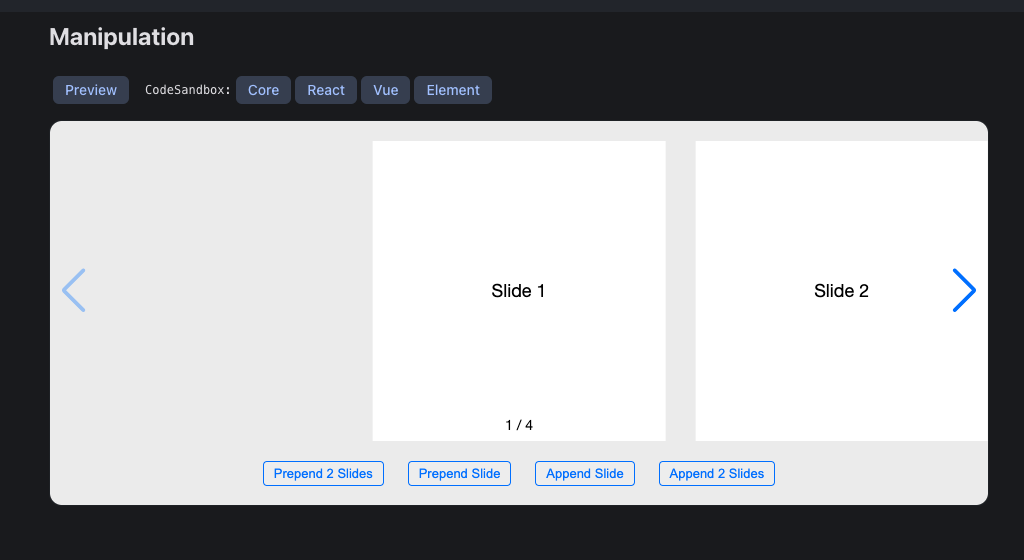
# 製作產品卡片
直接複製 Swiper JS Demo 中的 Manupulation 來改寫,因為此範本最貼近我理想中產品卡片 swiper,刪除多餘的並改寫程式碼後再用 tailwind css 客製化樣式
- import Swiper 相關 css 及模組
- 移除範例中的 prepend 和 append 相關程式及按鈕
- 一樣直接先用 dummy data 產品資料
import { useEffect, useState } from "react";
import { Swiper, SwiperSlide } from "swiper/react";
import { Virtual, Navigation, Pagination } from "swiper/modules";
import "swiper/css";
import "swiper/css/navigation";
import "swiper/css/pagination";
import "swiper/css/scrollbar";
import { useProducts } from "@/hooks/useProducts";
import { Product } from "@/types/products";
const NewProductsSection: React.FC = () => {
const { data, isLoading, isError, error } = useProducts();
const [products, setProducts] = useState<Product[]>(data?.products || []);
useEffect(() => {
if (data?.products) {
setProducts(data.products);
}
}, [data]);
if (isLoading) return <p className='text-center text-gray-500'>載入中...</p>;
if (isError) return <p className='text-center text-red-500'>發生錯誤:{error?.message}</p>;
return (
<div className='p-5'>
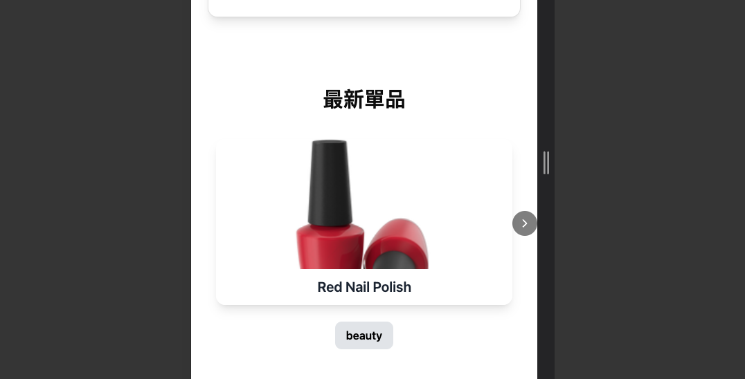
<h1 className='text-3xl font-bold mb-6 text-center'>最新單品</h1>
<Swiper modules={[Virtual, Navigation, Pagination]} slidesPerView={3} spaceBetween={10} centeredSlides={true} navigation={true} virtual className='w-full'>
{products.map((product: Product, index: number) => (
<SwiperSlide key={product.id} virtualIndex={index} className='p-4'>
<div className='relative rounded-4xl shadow-lg transform transition-transform hover:scale-105 overflow-hidden'>
<img src={product.thumbnail} alt={product.title} className='w-full h-60 object-cover' />
<div className='absolute bottom-0 w-full bg-white bg-opacity-90 p-3 text-center'>
<h2 className='text-xl font-semibold text-gray-800'>{product.title}</h2>
</div>
</div>
<div className='mt-6 px-4 py-2 text-center font-semibold text-black bg-gray-200 rounded-lg inline-block'>{product.category}</div>
</SwiperSlide>
))}
</Swiper>
</div>
);
};
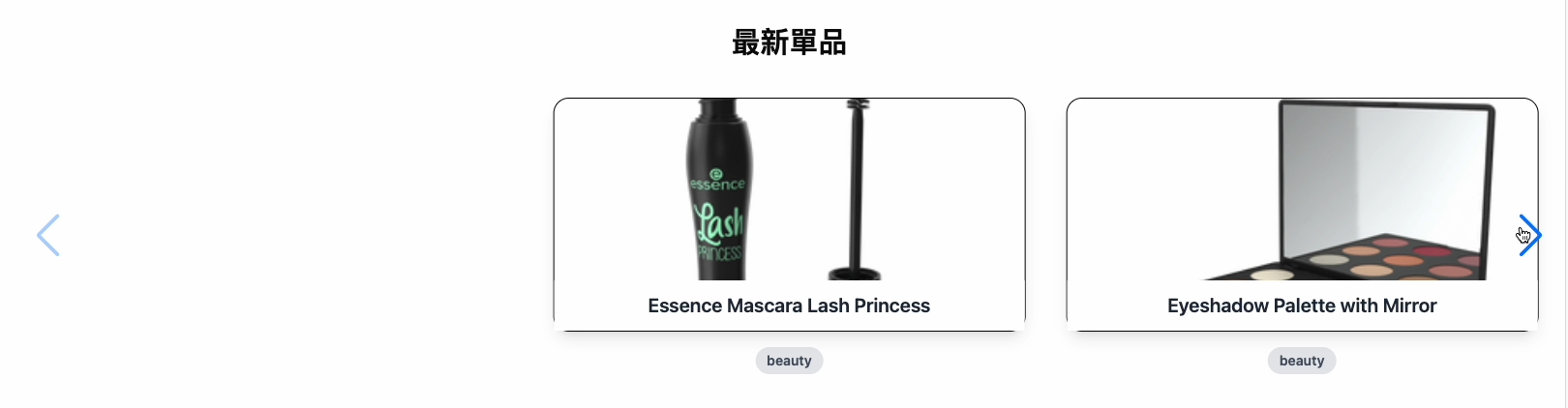
export default NewProductsSection;# 客製化 navigation 按鈕
Swiper 預設的 navigation 按鈕太醜,但拿掉又怕使用者不知道此產品展示櫃是能滑動的,所以選擇自己客製化 navigation 按鈕
步驟:
- 關閉 Swiper 預設的 navigation={true},改為手動綁定 prevEl 和 nextEl。
- 只保留右邊的導航按鈕,最小化對美觀的影響
- 添加 z-index 避免按鈕因為產品卡片難點擊,影響使用者體驗
- 自訂按鈕:
- 設計 小型黑色箭頭按鈕
- 設置圓角及半透明背景與 hover 效果提升質感
import { ChevronRight } from "lucide-react";

const NewProductsSection: React.FC = () => {
 ...
 const nextRef = useRef<HTMLButtonElement | null>(null);

 return (
  ...
  <Swiper
   modules={[Virtual, Navigation, Pagination]}
   slidesPerView={3}
   spaceBetween={10}
   centeredSlides={true}
   navigation=<!--swig2-->
   virtual
   className='w-full'
  >
  ...
  {/* 導航按鈕 */}
  <button id='custom-next' ref={nextRef} className='absolute right-0 top-1/2 transform -translate-y-1/2 bg-black/50 text-white p-2 z-1 rounded-full hover:bg-black/70 transition cursor-pointer'>
   <ChevronRight size={20} />
  </button>
 )
}
結果如下:
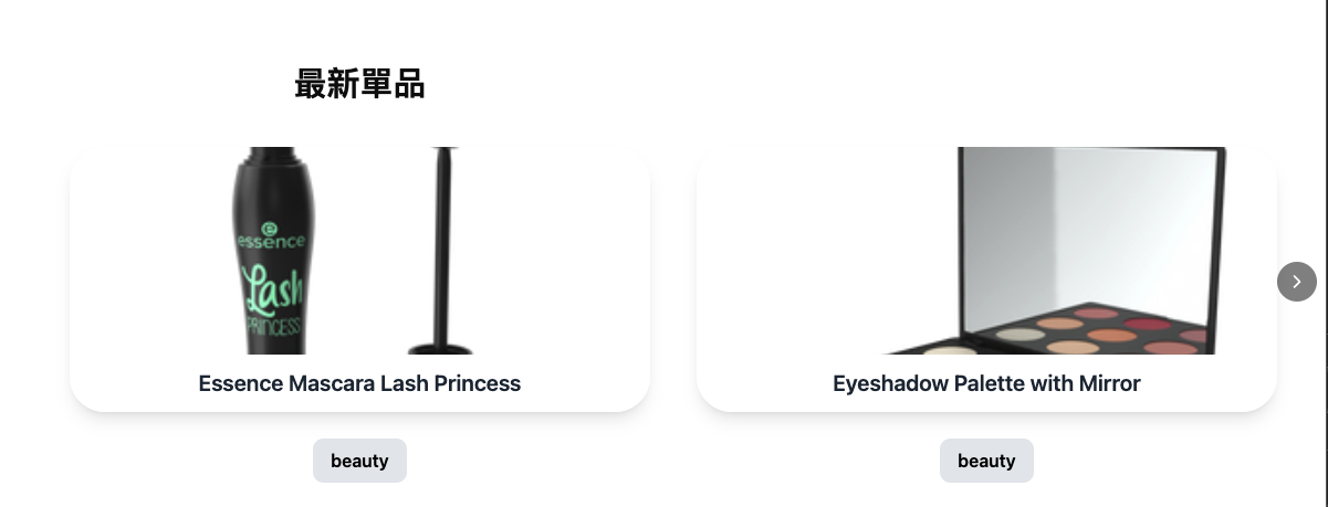
# RWD 製作
由於 SwiperSlide 組件必須是 Swiper 組件的直接子元素,而不能放在 Grid 容器內,所以比較不適合用 grid 去佈局
更好的做法是直接在 Swiper 組件中去定義 breakpoints 來設定不同的 slidesPerView 數量:
return (
    <Swiper
      modules={[Virtual, Navigation, Pagination]}
      slidesPerView={1}
      spaceBetween={10}
      breakpoints=<!--swig3-->
      virtual
      className='w-full'
    >
)
# 結果